How to Choose Bathroom Towel Colors: Simple Palettes for Fall
- Posted by
Allison Savino
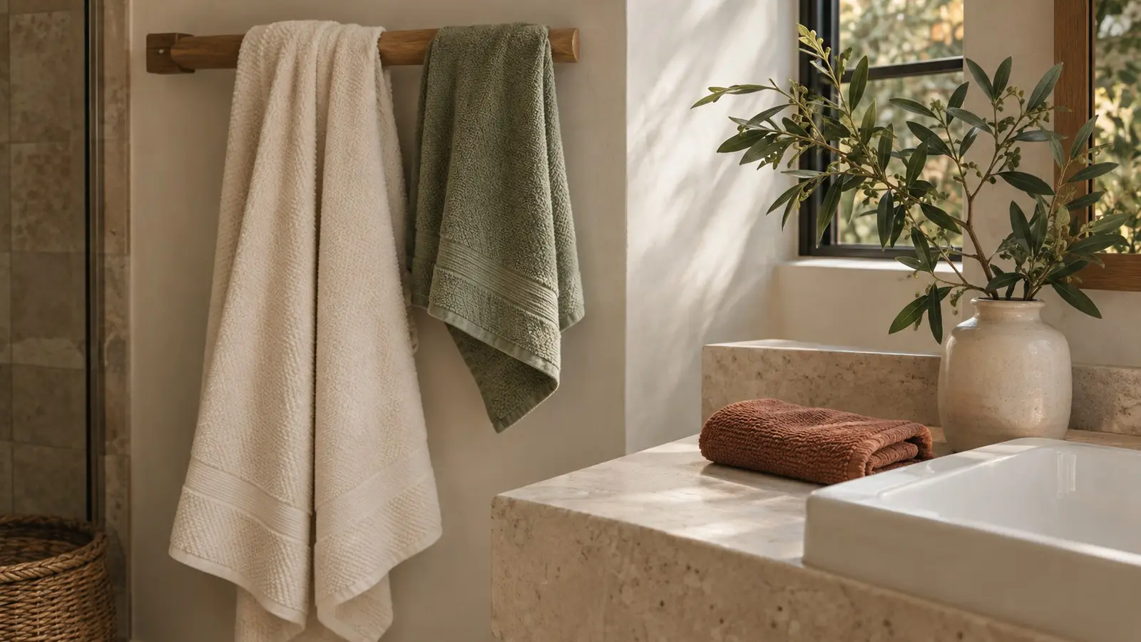
A bathroom can hold all your favorite everyday essentials and still feel visually busy. Sometimes the mismatch is not the tile, the countertop, or the cabinet. It is the collection of towels gathered over several years: one bright blue, two nearly white, and a stripe that has somehow become permanent.
Choosing bathroom towel colors is a small way to make the space feel more considered without replacing everything in it. For an early-fall refresh, start with the colors already in your room, keep useful towels in the mix, and build a simple palette around them. Your handmade soap and daily care essentials can belong in the scene without matching every thread.
Start with the bathroom finishes you already have
Before browsing towels, look at the largest fixed surfaces: walls, floor, countertop, and cabinet. Do they lean warm, cool, or somewhere in between? Cream tile, honey-colored wood, and beige stone often work comfortably with ivory, soft olive, and clay. Crisp white, blue-gray tile, and silver-toned fixtures can suit white, slate, and muted blue.
These are starting points, not design rules. A cool gray bathroom may look lovely with a warm terracotta hand towel. The useful question is whether the contrast feels intentional. Hold an existing towel against the tile and step back to the doorway. You will learn more from that simple comparison than from looking at an isolated color swatch.
Choose a main color and one supporting shade
You do not need an exact formula or a complete matching set. Try one main towel color for the larger pieces and a second shade for the smaller ones. Ivory bath towels with sage hand towels, for example, create a clear pattern without making the room feel overly coordinated.
If you want a third color, keep it small: a washcloth, a bath mat you already own, or the natural tone of a wooden soap dish. When every object introduces a different bold shade, the eye has more to sort through. Repeating a few colors gives the room a simpler visual rhythm.
Three easy bathroom towel palettes for fall
- Ivory, sage, and warm wood. A soft botanical combination that works beyond the season. Let the wood come from an existing shelf or accessory rather than adding another textile.
- Oatmeal, clay, and cream. A warm option for beige stone or neutral walls. A single clay-colored hand towel can provide enough autumn character.
- White, slate blue, and charcoal. A crisp combination for cooler finishes. Keep the darkest shade on a smaller piece if the room already feels visually heavy.
Use these as inspiration, not a shopping list. If your favorite towels are pale green, they can become the main color instead of the accent.
Look at color in the room, not only on a screen
An online photograph cannot show exactly how a towel will look beside your particular countertop. Screens, photography, and room lighting all affect the impression. A shade called “stone” might look gray in one photograph and beige in another.
Check available close-ups and color descriptions, then compare any new towel in the bathroom during daylight and again with your usual lights on. Keep packaging until you know you like the combination and understand the seller’s return terms. If you are choosing between two similar neutrals, the one that looks comfortable beside the largest fixed surface is usually the easier starting point.
Let texture create interest without adding more colors
A limited palette does not have to look flat. Looped terry, a waffle weave, and a smooth border each catch light differently. Similar shades across different textures can look thoughtfully layered rather than accidentally mismatched.
Choose the feel and function first, especially for pieces used with soap. Our guide to washcloth textures for handmade soap explores that practical side. Color is the finishing choice, not a reason to keep a cloth you do not enjoy using.
Try folding two existing towels together before buying anything. A plain towel beside a textured one may already provide the variation you wanted.
Coordinate with handmade soap without matching it exactly
Handmade soap can add a small point of color and character at the sink. It does not need to match the towels, and a bar’s appearance should not be the only reason you choose it. Read the current ingredient list, scent description, and directions, then pick something that fits your preferences.
Plumera’s handmade bar soap collection offers a place to explore those everyday choices. A neutral towel palette leaves room for the bar you actually want to use, whether its appearance is understated or more colorful.
Keep soap on an appropriate draining surface rather than resting it on a display towel. The textile can frame the sink area visually while remaining separate from the wet bar. Practical placement deserves a vote in the design.
Keep the refresh small enough to maintain
Start with the towel you see most often, usually the hand towel beside the sink. Swap it with a suitable one from your linen cupboard and live with the combination for a few days. You may find that no purchase is needed.
If you do buy something, choose a color that works with more than one existing piece. Follow the textile’s care label, including any instructions about washing colors separately. Keep usable older towels in rotation rather than retiring them simply because your palette has changed.
A coordinated space, not a showroom
The most useful bathroom towel colors are the ones that work with your room, your favorite essentials, and your real laundry routine. Begin with the fixed finishes, repeat one or two shades, and let texture add interest. For fall, a small warm accent is enough; the bathroom does not need a seasonal costume.
Bring that same simplicity to the sink: a towel you enjoy reaching for, a well-placed soap dish, and a handmade bar chosen for everyday use. Beauty Through Simplicity can look this ordinary—and this good.